
HAND LETTERING TUTORIAL: GETTING STARTED
/
With a little exploring you soon discover that hand lettering words and phrases in your art journal (or on anything else) is really about drawing letters, not writing them. And just like drawing anything else, we can all learn to draw if we're willing to learn some techniques—and of course, put in some practice.
And what's not to like about practicing different ways to draw and embellish letters?
It is a journey to learn how to create beautiful hand lettered art in your art journal and to develop your own unique style, and it all begins with the basics: a simple supply list and mastering a few foundational lettering styles.
First, gather some simple supplies
I like to keep my hand lettering supplies in one container. That way I can pull out my bin and head over to the couch. Hand lettering and a good television show work really well together!
What you'll need:
- Sharp, light pencil – such as mechanical pencil; a 2H pencil will also work.
- Eraser with small surface – such as on other end of mechanical pencil.
- Ruler - a transparent plastic ruler is useful.
- A small collection of fine-tip, archival black ink pens (i.e., waterproof) in various tip sizes. I like theSakura Micron Pens in .01, .03, .05 and .08 sizes AND Faber-Castell Fine and Bold tip pens. (You'll need different sized pens for different line widths.
You'll also need:
- Paper that's thick enough so ink won’t bleed through to other side, either in your art journal or perhaps a practice hand lettering journal.
- A large chisel-tip marker that makes lines about 1/4" thick in black or a bold color
- A white pen.
You might also like:
- Pigment mediums such as watercolors, watercolor pencils, markers, pastels, ink to color in your lettered artwork
- Tracing paper or deli paper
Next, learn these three basic styles of hand lettering.
There are many, many ways to draw letters. The possibilities are as infinite as the imagination—and artists out there can introduce you to all kinds of lettered art. But to begin, I believe you should know how to draw three basic letter styles and you can learn all three of them right now.
So take out a piece of scrap paper and follow along with directions below for each style. It's easy. Just choose one word seven or more letters long, and draw that word each time in each of the following styles.

It is helpful to draw light lines across your paper first with the ruler and pencil to keep your words aligned (Later, when you hand letter phrases or sentences, even, those ruled lines and penciled letters will be even more important).
1. Outlined block letters in either print or script.
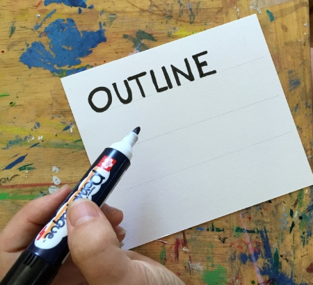
Let's begin with block letters. You probably know how to do this: Just write your letters with the chisel tip marker. You can square off the ends of your letters or angle them. Your letters can be all caps, lowercase or both. Just make sure they are thick block letters. Then outline around the edges of each letter in with your white pen. Wha la!

If you want the inside of your block letters to be empty, you will simply draw outlined shapes of each letter. Go slowly and imagine your letters are already block printed and you're outlining around each letter. Each letter is essentially one shape and you are drawing around the edges of that shape.
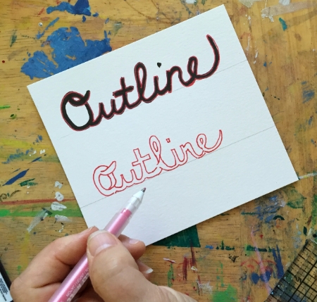
To outline the word in script isn't that much more difficult. What you basically need to do is outline around the word rather than each letter (since handwritten letters are connected, they are no longer separate shapes). It's easiest if you have a word already written in script (in your own handwriting) with the thick chisel-tip marker, like we did first with the block letters. You can write the word in pencil first and then go over it with the chisel marker, if you'd like. Then, just simply outline around the top, sides and bottom of the word with that white pen, never crossing lines.

Tip: Leave plenty of space between the connected letters (don't scrunch them) so there's room to add the outline.

It's more difficult to write an outlined scripted word that is blank inside (that is, without a word already written). You have to imagine where any letter crosses and keep that space open to create the block letters. Try it to see what I mean. It's much more difficult.
2. Shadowed Block Print
This is a fun hand lettering style that you probably did in grade school and might have forgotten.

First, print your word in thick block letters again, all caps with simple squared corners, completely filled in. I like to draw the outline of my letters with a Micron .03 first and then fill in the shapes with a thicker pen such as a Micron .08 or Faber Castell Bold. I always like the filling-in part because it allows you to clean up those less than straight lines. (You could of course, just clean up the lines and leave the insides blank for other embellishments later).
Next, you are going to create shadows for each letter. It's easy:
Decide if your shadow is falling right and below each letter or left and above them. The idea of course is that an imagined light is coming from the the opposite direction to cast those shadows.

For demonstration purposes, we will work with right and below. Beginning with the first letter, draw your shadow lines to the right and below each part of the letter. It's helpful to think of the block letters as made up of separate rectangle shapes (or arches), each sub-shape with four sides. You work with the right and bottom lines of each sub-shape of the letter (and ignore the left and top lines).
For letters made of only rectangles, such as a T, you will want connecting lines going down and to the right diagonally at each outside and inside intersection of two sub-shape rectangles. (Never above, never left.)
Tip: I find it helps to draw the diagonal down lines first, especially for those inside connections.
For curved letters or letters with curved lines, you will basically make half moons to the right of and below each sub-arch shape. Let's look at an O. Think of it with a left and right block arch that connect top and bottom to make the whole letter, with an empty space inside the two arches. Start at the top of the right arch and curve out to the right, then below the curve in a half moon. Then on the left arch, you'll make your shadow inside the empty space. Start inside top, and make a half moon following the inside curve to the bottom.

And that's block printing. It's not difficult once you get the hang of it and block letters can look great on your pages, especially when you play with colors both for the letters and their shadows.
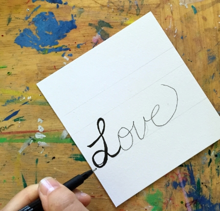
3. Bold Script Words
I love drawing a big word in bold script. Something about those curves! And what's nice about drawing script words is that you can begin with your own handwriting, but then plump up your lines to the thickness and curviness you desire. And the good thing is that if you don't like your handwriting, by the time you finished, your original lines are totally gone.
First, with your pencil simply write your word in your own curvy script handwriting about as large as you want it.

Second, Go over your word with a black Micron pen.
Tip: leave plenty of space between your letters; don't scrunch them.
Third, grab your Bold Faber-Castell pens and thicken up the lines of each letter in places as thin or as fat as you want. Play with the ends, too! You can exaggerate all you want. (Notice that the Bold Faber-Castell is juicier than the Micron so it covers more space, faster).

Finally, fill the letters entirely with either more black pen or doodles or color.
Why not play with this style several times in several styles? You will see how much variation you can have just with how you thicken lines and how you fill in the shapes.
So that's your three basic hand lettering styles: Outlined Block or Script, Shadowed Block or Bold Script words. Have fun playing with these styles and practicing these techniques in your art journa. In no time you'll have them down.